ShopDreamUp AI ArtDreamUp
Deviation Actions


Suggested Deviants


Suggested Collections


You Might Like…


Featured in Groups

Description
fix the mistake ...
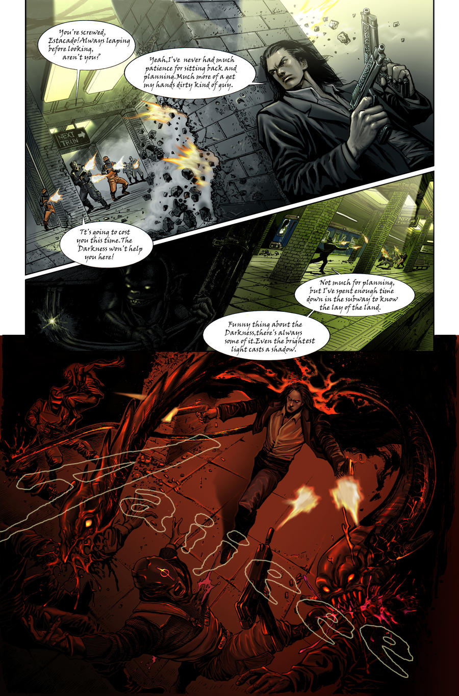
"There is some nice stuff going on here but I’m not a fan of triangle shaped panels as they always feel like everything is being forced/crammed into that space. The reader is following a story and shouldn’t be distracted by the shape of a panel. I like the spatial separation between Jackie and the Brotherhood goons in panel #1 as it sets up the rest of the action nicely. The Darkling in panel #2 is a bit too dark (pun intended) and its hard to see what he’s doing. The artist takes a risk in the last panel with the angle but for the most part it works. The only issues I have with it are Jackie’s leg being out of proportion to the angle of the shot and the “in perspective” Aaiieee. Because the SFX is in perspective and dead center it’s the first thing you see in the panel. That’s a no-no but easily fixed. I like this page a lot." -Mark Silvestri
It's my honour and luck to have comment by Marc Silvestri.Thanks alot!
Congratulations to all winners and semi-finalists.,
In fact there are so many great entries ,
I'm lucky and glad to win the 3rd prize.
Image size
2063x3131px 4.39 MB
© 2011 - 2024 oldmarksir
Comments48
Join the community to add your comment. Already a deviant? Log In
This is kickass!
The Darkness are better than Team Fortress 2.
The Darkness are better than Team Fortress 2.